Why Do Cars Use Horizontal Dashboard Lines?
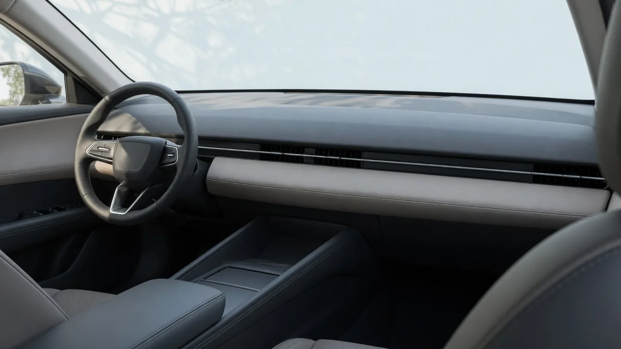
In many modern cabins, the main lines of the dashboard run side to side. Trim strips, air vents, lighting, and screen housings follow that direction rather than running up and down. Horizontal car dashboard design is more than a styling trend. It affects how roomy a cabin feels, how screens and controls fit together, and how easily the driver can keep watching the road. This guide explains those three reasons and where each one stops applying.
Perceived width
The most direct reason designers favor horizontal lines is visual. The eye tends to follow a continuous line to its end. A band that runs from one door to the other draws attention across the full width of the cabin. That sweep makes the interior look wider and calmer than a layout split into separate vertical blocks. A tall center stack works the other way. It divides the dashboard into a driver zone and a passenger zone, which can make each half feel narrower. Designers often strengthen the effect by placing several elements on the same level: a trim inlay, the vent outlets, a strip of ambient lighting, and the top edges of the door panels. When those lines connect visually, the dashboard and doors look like one wraparound surface instead of separate parts.
Perceived width also shapes how the whole vehicle comes across. A low, wide dashboard echoes the planted stance designers try to give the exterior, and it can make a compact cabin feel less confined. The effect is only perceptual. The cabin does not get any larger, and real shoulder room still depends on the body structure, seat placement, and door panel shape. Horizontal lines just make the existing space feel more open. Color and material choices change how strong the effect is. A light-colored upper dashboard tends to fade into the background, while a dark, glossy band draws the eye. The same line can therefore feel spacious or heavy depending on how it is finished.
Display integration
Screens have become one of the strongest reasons for horizontal dashboard layouts. Instrument clusters and infotainment displays are usually wider than they are tall, because wide formats suit maps, side-by-side menus, and gauges arranged in a row. Placing these displays along a horizontal axis lets them sit within the dashboard's main line instead of breaking it up. Some interiors put the cluster and the central screen under a single glass panel or a shared housing, so the displays become the main horizontal element. Others keep the screens separate but line up their top or bottom edges so they still look like parts of one band.
A horizontal layout also helps sort information by priority. The things a driver checks most often, such as speed and warnings, can sit directly ahead. Navigation and media can extend toward the center, where the passenger can also see and reach them. Spreading functions across the cabin this way avoids stacking them down the center console, where lower positions take a longer glance away from the road. Physical controls often follow the same logic, with a row of climate buttons or a slim switch strip beneath the screen continuing the display's line. The approach also affects packaging. A wide, shallow arrangement still has to leave room behind the dashboard for ducting, wiring, the steering column, and airbag modules. The visible line is often a compromise between appearance and what the structure underneath allows.
Sightlines
Horizontal dashboard lines also relate to how the driver sees the road. A dashboard top that stays low and level across the cabin can keep the forward view clearer and gives the eye a stable reference at the base of the windshield. Designers often aim for a calm, level line in the driver's peripheral vision, loosely similar to how a horizon helps with orientation. When the main dashboard line runs roughly parallel to the road ahead, the shift from looking at the interior to looking outside feels smooth rather than cluttered.
Display height is closely tied to sightlines. Screens mounted high on the dashboard, near the driver's line of sight, generally shorten the distance the eyes travel between the road and the display. A horizontal band at that height keeps information close to the windshield without rising into the view the way a tall freestanding unit can. The height still has to be balanced. If the band sits too high, it can block part of the forward view for some drivers or reflect in the glass. Designers manage glare with hoods, anti-glare surfaces, and the angle of the dashboard top. The final height reflects trade-offs between visibility, reach, and readability.
Practical implications and limits
For owners, a horizontal dashboard matters more in daily use than on a spec sheet. When judging a cabin, sit in your normal driving position and check three things. First, check whether the upper dashboard line blocks any part of the road. Second, check whether the screens fall within a quick downward glance. Third, check whether the controls along the band can be reached without leaning. It is also worth checking for reflections in bright sun, since a light or glossy dashboard surface can mirror into the windshield. These checks matter more than the styling, because the same design idea can be done well or poorly.
The approach has limits. Horizontal lines do not create real space, and a wide sweep of trim can make a cabin feel busy if it is crowded with vents, seams, and mixed materials. A wide screen that extends far toward the center may be easy to see but harder for the driver to reach. Touch controls along a flat band can also demand more visual attention than physical buttons with distinct shapes. Not every interior follows the pattern. Vehicles built around ruggedness, an upright commanding view, or specific storage needs may use more vertical elements, and those choices can be just as deliberate. The horizontal theme is a common design tool, not a rule.
How a particular dashboard works in practice depends on the vehicle, the trim, and the driver's seating position. General principles explain the intent, but not the result in any one car. Seat, steering column, and display brightness adjustments can line up your eye height with the dashboard line, and they often do more for comfort and visibility than the design alone. Knowing why cars use horizontal dashboard lines makes it easier to judge whether a given layout actually works for you.