Why Did Car Interiors Become More Driver-Focused?
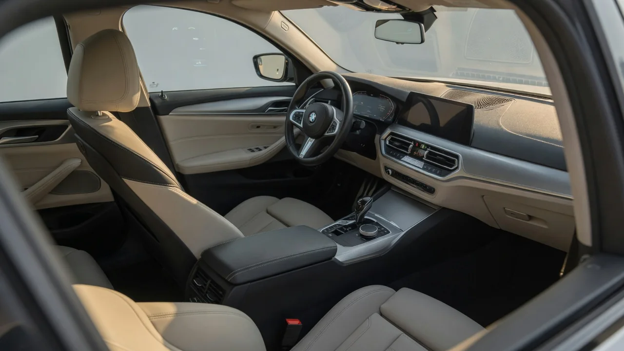
Car interiors became more driver-focused because driving grew more demanding. Higher speeds, denser traffic, more onboard systems and a better understanding of human attention pushed designers to put controls within easy reach, place key information in the driver's line of sight, and shape seats and steering around the body. The history of the driver-focused cockpit is mostly about reducing effort, distraction and reaction time. Styling and marketing also played a part.
Controls: From Scattered Levers to Fingertip Reach
Early automobiles needed constant manual work. Depending on the design, a driver might have to adjust ignition timing, manage the fuel mixture and operate brake or gear levers that sat on the floor or even outside the body. Layouts differed between manufacturers, so each machine had to be learned separately. As automatic mechanisms took over jobs like spark timing and cold starting, fewer controls were needed during normal driving, and the remaining ones could be grouped more logically. Common conventions also emerged, such as a shared pedal order and a steering wheel with nearby control stalks. Those conventions made cars far more predictable to operate, which is a precondition for designing an interior around the driver rather than around the machinery.
The next step was moving secondary functions closer to the hands. Stalks on the steering column let drivers work turn signals, lights and wipers without letting go of the wheel. Later, buttons on the steering wheel spokes added control of audio, phone calls and cruise control. The principle behind these changes is simple: keep the hands on the wheel and the eyes on the road. A center console angled slightly toward the driver and a gear selector placed near the natural resting position of the right or left hand follow the same logic.
As cars gained climate systems, navigation, infotainment and driver-assistance settings, the number of functions outgrew the space available for dedicated switches. Designers generally sort controls by how often they are used and how urgent they are. Frequent or safety-related functions stay closest to the driver, while occasional settings move into menus. Touchscreens made this consolidation easier and allowed features to change through software, but they remove the ability to operate a control by feel. That trade-off explains why many interiors keep physical buttons or knobs for the most common tasks even when a large screen handles everything else.
Instruments: Putting Information in the Line of Sight
Some early dashboards carried only a few gauges, and they were not always placed directly in front of the driver. As speeds rose, the speedometer became essential, and grouping the main instruments in a cluster behind the steering wheel shortened the eye movement needed to read them. A hood or binnacle over the cluster helps reduce glare and windshield reflections. Placing gauges where the driver can see them through or above the wheel rim, with minimal head movement, became a basic goal of instrument panel layout.
Warning lights replaced or supplemented many gauges. A light that turns on only when something needs attention is faster to interpret than a needle that must be read and judged, although it gives less detail about gradual changes. Standardized symbols and color coding help drivers recognize a problem at a glance. Red typically signals an urgent condition and amber or yellow signals caution, though exact meanings vary by vehicle and are defined in the owner's manual.
Digital instrument clusters and head-up displays extend the same idea. A configurable cluster can show navigation prompts or assistance-system status directly in front of the driver, reducing glances toward a center screen. A head-up display projects selected information near the driver's view of the road. These technologies only help if the information is well chosen. A crowded display can demand as much attention as the gauges it replaced, and readability depends on brightness, contrast and the driver's seating position.
Ergonomics: Designing Around the Human Body
Ergonomics, also called human factors, turned interior design from an arrangement of parts into a study of people. The discipline draws partly on aviation, where cockpit layout directly affects workload and error rates. Automotive designers use body-size data, reach zones and sightline analysis to decide where controls and displays must sit so that drivers of very different heights can operate them without shifting out of a safe, comfortable posture. A control that a shorter driver cannot reach, or a gauge that a taller driver's knee or the wheel rim hides, counts as a design failure, not a matter of taste.
Adjustability is how one interior fits many bodies. Seats that move in several directions and offer height and backrest adjustment, along with tilt and telescoping steering columns and, in some vehicles, adjustable pedals, let each driver line up hands, feet and eyes with the controls. Correct seating also matters for safety, because seat belts and airbags are designed around an occupant who is sitting in a reasonable position relative to the wheel and dashboard.
The visible wraparound cockpit, with a dashboard and center stack turned toward the driver, blends ergonomics with image. Angling the controls does shorten reach and viewing angles, but the look is also used to suggest sportiness, and it borrows visual cues from racing and aircraft. The trade-off is that the front passenger may find shared controls harder to see or reach, which is why some interiors aim for a more neutral layout.
Practical Implications and Limits
A driver-focused interior only delivers its benefits once it is set up for the person using it. Before setting off, adjust the seat, steering wheel and mirrors so that the instruments are fully visible and every frequently used control can be reached without leaning. It also helps to spend a few minutes learning where things are while parked, especially in an unfamiliar vehicle, rather than searching while moving. The owner's manual is the authoritative reference for what specific symbols, buttons and menu settings do in a particular car, because these details are not universal.
The approach also has limits. Orienting the cabin toward the driver does not guarantee lower distraction. Menu-based functions can still pull attention away from the road, and assistance systems shown in the cluster still require the driver to supervise them. Some styling choices look like functional cockpit design without improving reach or visibility. Owners of older or classic vehicles should expect different conventions, including manual controls and less standardized layouts. When replacing an instrument cluster, steering wheel or switch assembly, follow the vehicle-specific service manual, since airbag, wiring and calibration requirements vary between models and cannot be inferred from general design principles.