What Is a Motor Efficiency Map? Speed, Torque, Losses and Calibration
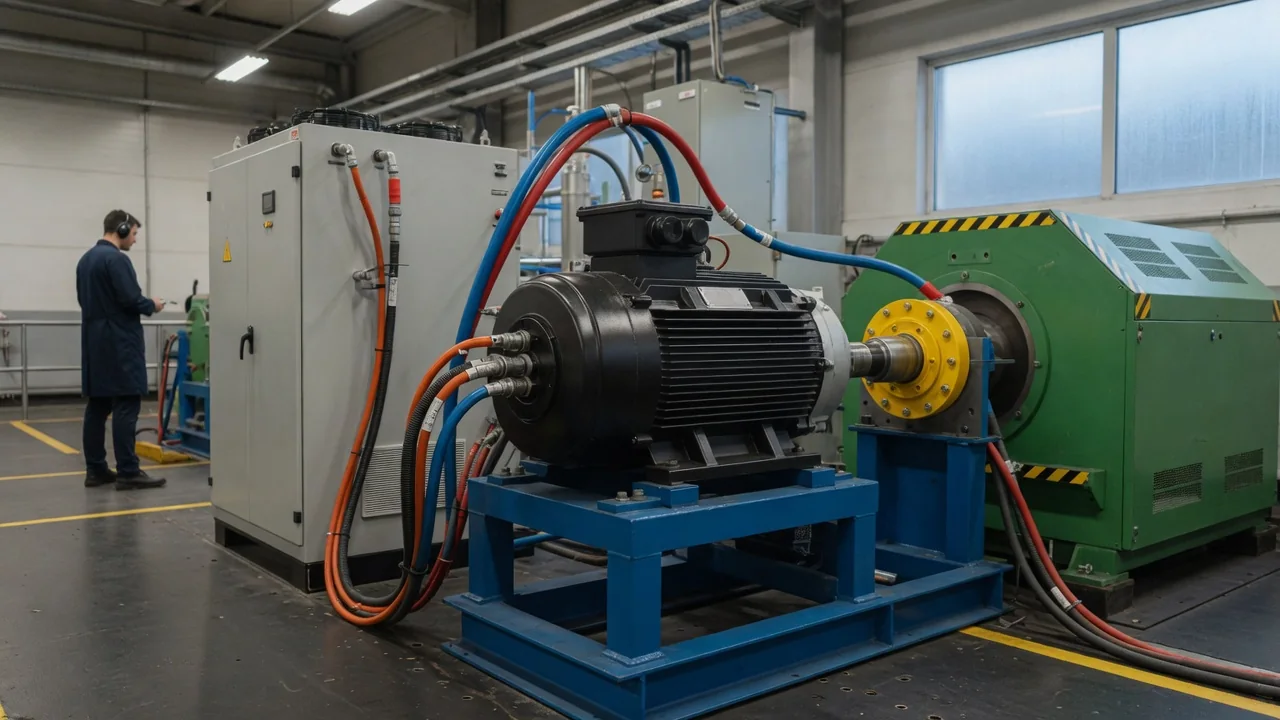
A motor efficiency map is a chart that shows how well an electric motor converts electrical power into mechanical power across its full range of operating speeds and torques. Engineers use it to see where a motor works best and where energy turns into heat instead of motion. For anyone asking what an EV motor efficiency map actually represents, the short answer is this: it explains why the same motor can be very efficient in one driving situation and noticeably less efficient in another.
Speed and torque on the map
Most efficiency maps place motor speed, usually in revolutions per minute, on the horizontal axis and torque on the vertical axis. Every point inside the chart is an operating point: a specific combination of how fast the shaft turns and how hard it pushes. Mechanical output power at that point equals torque multiplied by rotational speed. Contour lines or color bands then show efficiency as a percentage, meaning mechanical output divided by electrical input when the motor is driving the vehicle. Many maps also include a negative torque region below the zero line, representing regeneration, where the motor works as a generator and efficiency is calculated in the opposite direction.
The outer boundary of the map is the torque envelope. At low speeds, maximum torque is typically flat because it is limited by how much current the motor and inverter can safely carry. As speed rises, the voltage the motor generates internally, called back electromotive force, approaches the voltage available from the battery and inverter. Beyond this point, often called base speed, the controller must weaken the magnetic field to keep spinning faster, and available torque falls roughly in proportion to rising speed. This is described as the constant-power region. The envelope ends at the maximum permitted speed. Some maps show separate peak and continuous limits, since short bursts of torque are possible that would overheat the motor if sustained.
Inside the envelope, efficiency is not uniform. A typical map shows an area of highest efficiency, sometimes called the efficiency island, usually at moderate speed and moderate torque. Efficiency drops toward the corners: at very low speed with high torque, and at very light loads where little useful work is being done. The exact shape depends on the motor type, such as permanent magnet synchronous or induction designs, and on the specific design choices, so no single map represents all electric motors.
Losses that shape the efficiency contours
The contours on an efficiency map are really a picture of where losses occur. The first major category is copper loss, the resistive heating in the stator windings. Because torque is closely tied to current, and resistive loss grows with the square of current, copper losses dominate at high torque. That is why the low-speed, high-torque corner of a map usually shows lower efficiency. Winding resistance also rises with temperature, and at higher electrical frequencies additional effects inside the conductors can increase the effective resistance further.
The second category is iron or core loss, caused by hysteresis and eddy currents in the laminated steel of the stator and rotor. These losses rise with electrical frequency, which increases with speed, and with magnetic flux density. Permanent magnet motors can also experience eddy current losses in the magnets themselves. Mechanical losses from bearing friction and air drag on the spinning rotor add to this and also grow with speed. At high speed and light torque, these losses become a large share of a small output, so efficiency falls. In the field-weakening region, the controller also has to supply current that opposes the magnet field rather than producing torque, adding copper loss without adding output.
The inverter adds its own losses. Power semiconductors lose energy while conducting current and each time they switch on and off, so switching frequency and DC voltage both matter. Some published maps show the motor alone, while others show the complete drive system including the inverter, and some include a reduction gear. Test conditions such as coolant temperature and supply voltage also influence results. Knowing what a particular map includes is essential before drawing any conclusions from it.
Vehicle calibration and the efficiency map
An efficiency map is not determined by hardware alone. The motor control software decides how to deliver each requested torque at each speed, typically by choosing a combination of current components for the stator. Common strategies include maximum torque per ampere at lower speeds, which minimizes current for a given torque, and controlled field weakening at higher speeds. These decisions are stored in calibration tables that engineers develop through testing, often on a dynamometer. The measured efficiency map is therefore partly a result of these calibration choices, and different control settings on the same motor can produce a different map.
At the vehicle level, engineers often overlay expected driving patterns onto the map to see where the motor spends most of its time. The gear reduction ratio influences this placement, because it determines what motor speed corresponds to a given road speed. In vehicles with more than one motor, control strategies may distribute torque between them in ways intended to keep operation in more efficient regions, though the specific approach varies by design. Regenerative braking calibration also uses the map, balancing energy recovery against the limits of the motor, inverter and battery, and blending with the friction brakes when needed.
Calibration also protects components. Thermal models can reduce available torque when the motor or inverter runs hot, and battery voltage, which varies with state of charge and load, shifts where field weakening begins. As a result, the usable envelope and the efficiency at a given operating point can change with conditions rather than staying fixed.
Practical implications and limits
For drivers, the motor map is only one part of the energy picture. Real-world consumption also depends on battery behavior, tire rolling resistance, aerodynamic drag, climate control use, terrain and driving style. At sustained highway speeds, for example, aerodynamic drag usually becomes the main reason energy use rises, regardless of how efficient the motor is at that operating point. An efficiency map alone cannot predict a vehicle's range, and a small difference in peak motor efficiency may matter less than these other factors.
Manufacturers rarely publish complete efficiency maps for production vehicles. When a single peak efficiency figure appears in technical or promotional material, it describes the best point on the map, not the average efficiency during normal driving. Maps from different sources are difficult to compare unless they share the same test conditions, include the same components and use the same measurement approach. Most maps also describe steady-state operation, so they do not fully capture rapid acceleration, transient thermal effects or long-term changes as components age.
For owners and technicians, the efficiency map is a design and engineering concept rather than a diagnostic tool. It cannot be measured in a typical workshop, and reduced power or unexpected energy use is normally investigated using the manufacturer's service procedures, fault codes and specified tests. Understanding the map still helps explain why an electric drive behaves differently in city traffic, on the highway, during hard acceleration and while regenerating energy.