What Is a Minimalist Car Cockpit? Controls, Screens and Driver Adaptation
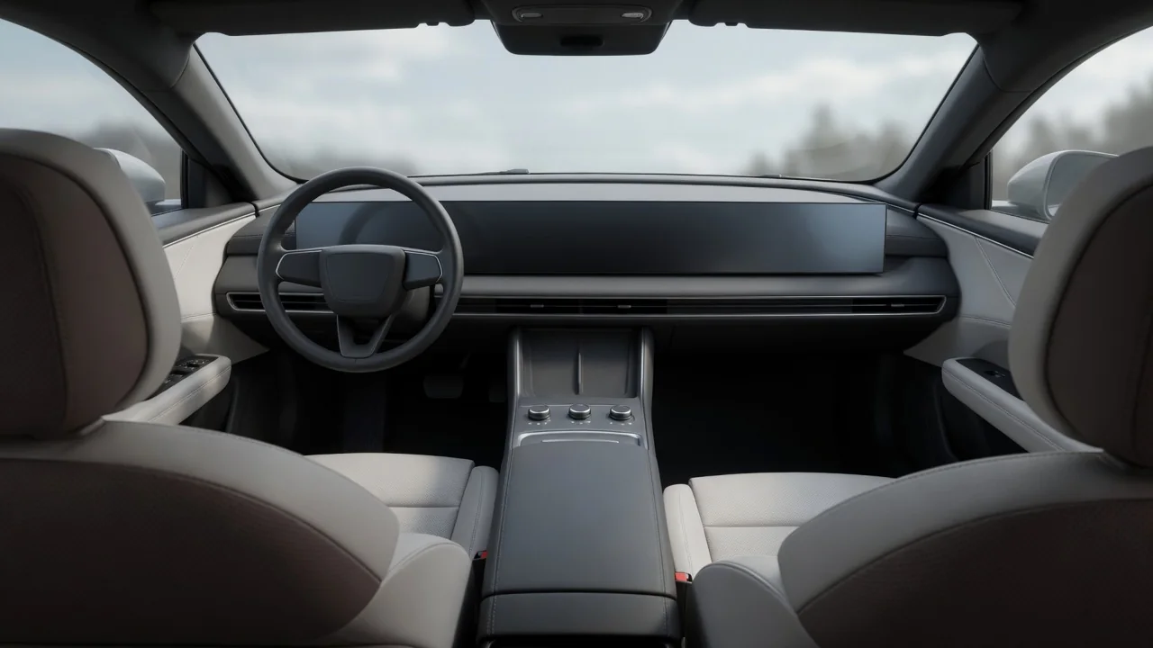
A minimalist car cockpit is an interior layout that reduces the driver's workspace to a small number of physical controls, clean surfaces and one or more central displays. Instead of rows of buttons and knobs, many functions are grouped into on-screen menus, voice commands or steering wheel inputs. Minimalist vehicle cockpit design trades visual clutter for a calmer look, but it also changes how drivers find, learn and operate everyday features.
Reduced controls
The defining trait of a minimalist cockpit is the removal or consolidation of physical controls. In a conventional dashboard, many functions have a dedicated switch: a knob for fan speed, a button for rear defrost, a dial for audio volume, a row of keys for climate modes. A minimalist layout cuts that count by moving secondary functions into software and keeping only a handful of hardware inputs. What remains physical depends on the design philosophy and on the requirements of the markets where a vehicle is sold. The steering wheel, pedals, hazard warning switch and some form of gear selection are generally kept as distinct controls, while items such as seat heating, mirror adjustment or ambient lighting may move into touch menus. Some designs relocate controls rather than delete them, placing them on steering wheel spokes, stalks or a small console cluster.
Reduced controls also shape the physical architecture of the interior. With fewer switch panels to package, designers can use a lower, flatter dashboard, a cleaner center stack and more open storage between the front seats. The number of individual switches can fall, while the electronics behind the remaining displays and control modules take on a larger role. Minimalism in this sense is not only an aesthetic choice; it is a decision about where each function lives and how many steps it takes to reach it. A single multifunction control, such as a rotary dial, a scroll wheel or a touch-sensitive surface, may handle several tasks depending on the active mode. That reduces hardware, but it adds context the driver must keep track of.
Display reliance
When physical controls disappear, displays absorb their work. Most minimalist cockpits are organized around a large touchscreen that handles navigation, media, climate, vehicle settings and often driver assistance options. Core driving information such as speed and warning indicators may appear on a dedicated driver display, a compact screen near the base of the windshield, a head-up display or, in some layouts, the central screen itself. These arrangements vary considerably between manufacturers, so the exact location of a given function should be confirmed in the owner's manual for the specific vehicle.
Display reliance shifts interaction from feel to sight. A physical knob can be found by touch, and its position or detent confirms the setting without looking. A touchscreen button usually requires the driver to glance at the screen, locate the target and check the result visually. Designers try to offset this with larger touch targets, persistent shortcut bars, haptic or audible feedback, and voice control for common requests. Software also brings real advantages: menus can be reorganized, features can be added through updates, and information can appear only when it is relevant, which keeps the screen less crowded than a panel of permanent buttons.
The trade-off is that cockpit usability becomes tied to software quality, screen responsiveness and menu depth. How quickly the system starts after the car is switched on, how it behaves if it lags or restarts, and how readable the display stays under glare, reflections or fingerprints are all part of the everyday experience of a screen-centered interior.
User adaptation
Moving into a minimalist cockpit usually involves a learning period. Drivers accustomed to conventional layouts rely on muscle memory: reaching for a familiar knob without taking their eyes off the road. In a display-centered interior, that memory has to be rebuilt around menu locations, gesture patterns, steering wheel shortcuts and voice phrases. Early on, simple adjustments can take longer simply because the driver is still searching for where a function lives. Over time, frequent tasks tend to become more routine as the driver learns the layout and sets up shortcuts.
Adaptation is not uniform. Comfort with smartphones and touch interfaces, eyesight, age and how often someone drives the vehicle all influence how quickly the layout feels natural. Shared vehicles add another layer: a household car with several drivers, a rental, or a car handed to a valet or service technician may be operated by people who have never seen its menus. Driver profiles, where available, can store seat, mirror and display preferences, but they do not remove the need to learn the basic structure. Voice assistants help some users considerably, yet their usefulness depends on recognition accuracy, supported languages and, for some features, network connectivity.
A practical way to shorten the learning curve is to explore the system while parked: locate defrost, wiper and climate settings, configure any customizable shortcut buttons or favorites, and learn which functions the steering wheel controls can reach directly. Reading the relevant section of the owner's manual is also worthwhile, because menu names and organization differ from one system to another.
Practical implications and limits
The real test of a minimalist cockpit is the set of tasks performed while moving: clearing a fogged windshield, changing wiper speed, adjusting temperature or turning down the volume. Anyone evaluating such an interior benefits from identifying which of these remain physical controls and how many steps the rest require. Conditions matter too. Wearing gloves, driving on a rough road or dealing with bright sunlight can make precise touch input harder than it is in a showroom, so a test drive that includes these routine adjustments reveals more than a static walkaround.
Consolidation also concentrates risk. In a traditional dashboard, a failed switch typically affects one function; in a display-centered layout, a screen or control module fault can limit access to many functions at once, depending on how the vehicle is engineered and what fallback controls it provides. Diagnosis and repair may involve module replacement or software procedures rather than swapping a single switch, and the specifics are vehicle-dependent. Software updates can improve a system but may also rearrange menus, which means learned habits sometimes need adjusting after an update.
Finally, minimalism is a spectrum rather than a fixed standard. Many interiors blend a central screen with a short row of physical keys, while others push nearly everything into software. The label alone says little about usability; the more useful measure is how directly a driver can reach the functions they use most, and how well the design supports doing so without diverting attention from the road.