How to Read a Hybrid Energy-Flow Display
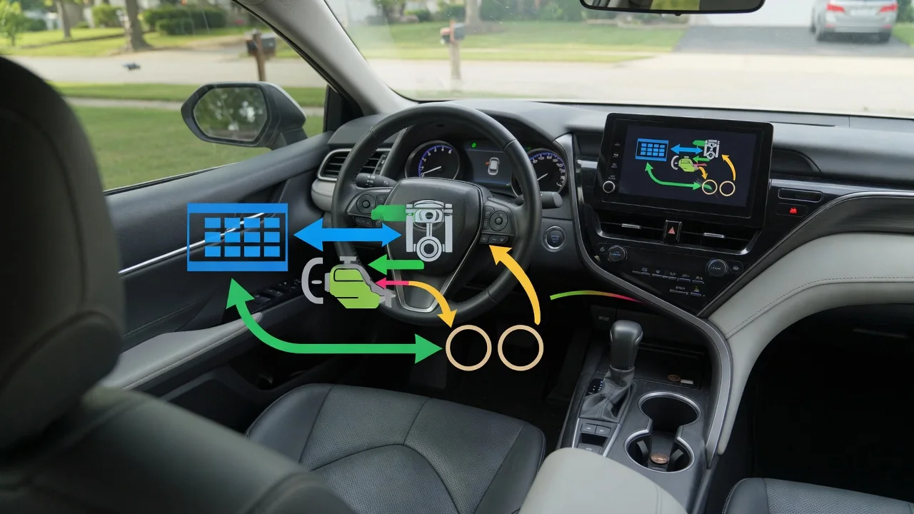
Learning how to read a hybrid energy flow display turns a busy animation into useful feedback. The screen is a simplified map of where power comes from and where it goes at a given moment. Once you understand the basic icons, arrows, and meters, you can tell whether the engine, the battery, or the brakes are doing the work, regardless of how your vehicle draws it.
Power sources
Most energy-flow screens show three or four icons: a gasoline engine, a high-voltage battery, one or more electric motors, and the drive wheels. Lines connect them, and those lines light up or animate when power is moving. If only the path between the battery and the wheels is active, the car is running on electricity alone. If the engine path is lit, combustion is contributing, either to move the car, to generate electricity, or to do both at the same time.
Blended operation is common, so expect to see two sources feeding the wheels together during brisk acceleration or highway merging. Some vehicles show the engine sending power to the wheels directly, while others show it feeding a generator first, depending on how the drivetrain is arranged. Plug-in hybrids may add a charge port icon or a separate electric range readout. The owner's manual identifies each symbol, which matters because similar shapes can represent different components from one manufacturer to another.
Charging arrows
Arrow direction is the most important detail on the screen. Arrows pointing away from the battery mean stored energy is being spent to drive the motor. Arrows pointing toward the battery mean it is being recharged. During deceleration or braking, you will typically see arrows travel from the wheels back to the battery, which represents regenerative braking: the motor acts as a generator and recovers motion that would otherwise be lost as heat in the friction brakes.
The battery can also charge from the engine. In that case arrows run from the engine icon to the battery, often while another set runs to the wheels, showing that the engine is producing more power than the car needs for propulsion and storing the surplus. Many displays use color to separate the two directions, such as one shade for discharge and another for charging, but the color choices are not standardized. Check which color means what on your vehicle before drawing conclusions from it.
Interpreting snapshots
The display shows an instant, not a trend. A single glance might catch the engine running at a stoplight, which looks wasteful until you realize it may be warming up, supporting cabin heating, or bringing the battery back to its preferred level. The control system switches modes many times per minute, so one frame rarely tells the whole story. Watch the pattern across a full acceleration, cruise, and slowdown cycle to understand what the car is actually doing.
The battery gauge deserves similar caution. Its bars or percentage usually represent a usable window rather than the full physical capacity, because the system keeps a reserve at both ends to protect the pack. Seeing the gauge sit near the middle is normal for a conventional hybrid, and it rarely reads completely full or empty. A power or charge meter with a needle or bar sweeping between charge, eco, and power zones gives the same information in a different form: how hard you are asking the drivetrain to work.
Everyday Use and Observations
In daily driving, the screen works best as a coaching tool. Gentle pressure on the accelerator from a stop often keeps the car on electric power longer, and you can watch the engine path stay dark as you do it. Lifting off early before a red light produces a longer stretch of charging arrows than braking late and hard, because heavy stops rely more on the friction brakes. On a long downhill, you may see the battery fill and regeneration taper off.
Conditions change what you observe. In cold weather the engine tends to run more often, since it supplies heat and the battery accepts charge less readily when chilled. Heavy air conditioning use, steep climbs, and sustained high speeds also shift the balance toward the engine. None of this indicates a problem by itself. Comparing the display on a familiar route in different seasons gives a realistic sense of normal behavior for your car, which is more useful than comparing against another model's habits.
Limits and Next Steps
An energy-flow display is an illustration, not a diagnostic instrument. It simplifies complex power management into a few lines and does not report battery health, cell condition, or component temperatures. The animation may lag slightly behind real events, and it should never pull your attention from the road. Study it when parked or as a passenger, and rely on quick glances while driving. Trip summaries and average fuel economy readouts offer a better record of long-term efficiency than the live graphic.
If the behavior changes noticeably, such as the engine running almost constantly in mild weather, the battery gauge swinging rapidly, or a warning light appearing, treat that as a reason for professional evaluation rather than a conclusion. Any stored fault code is evidence a technician must interpret with vehicle-specific information, not proof that a particular part has failed. High-voltage components carry serious shock risk and should be inspected only by qualified technicians. For everything else, the owner's manual remains the best guide to your specific screen.